
Video Storytelling
What is Peacebuilding?

CHALLENGE
The existing website was not effectively telling MBBI’s story.
THE WEBSITE LOOKED DATED.
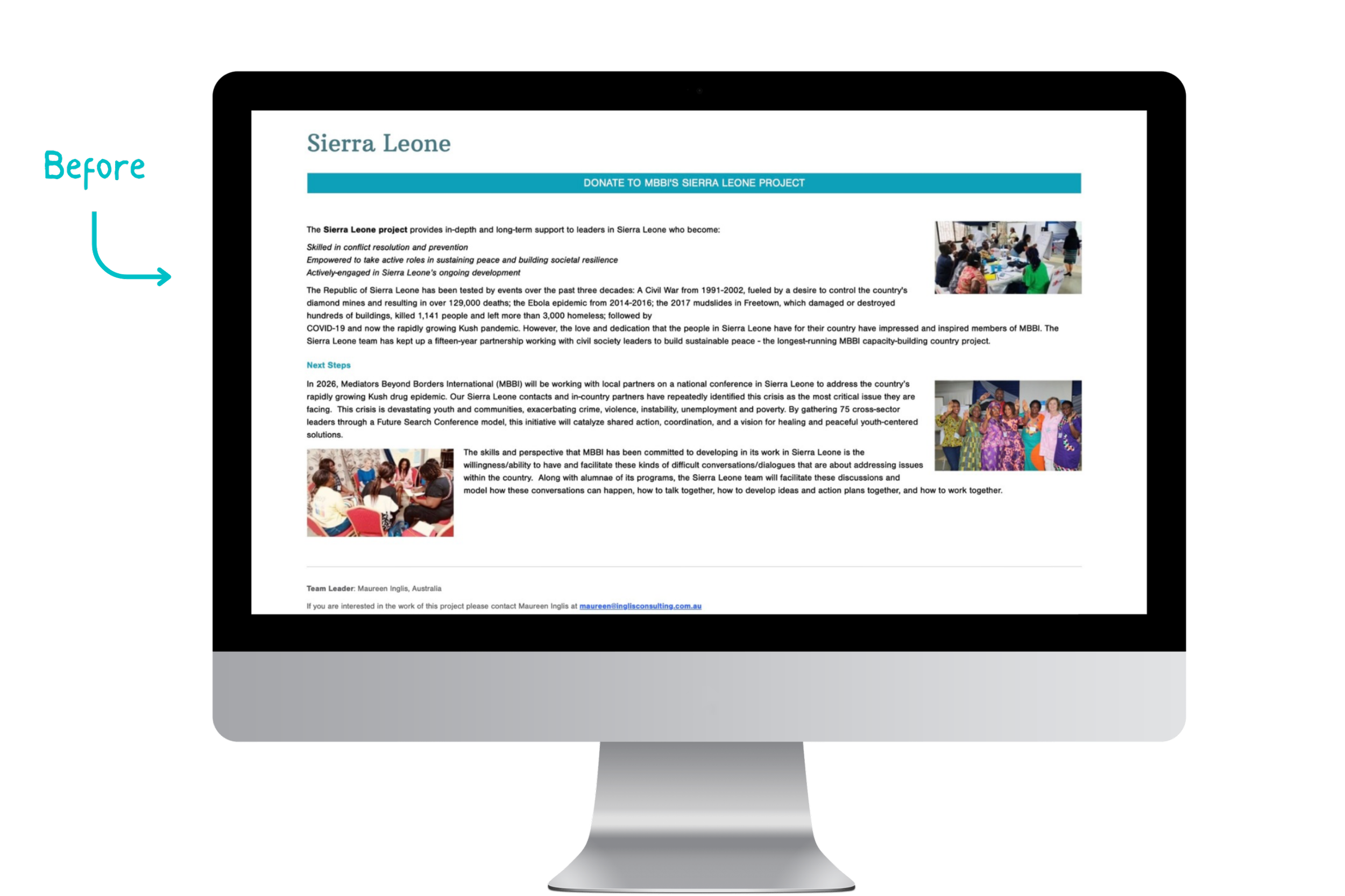
The website had grown over time, and it showed. The visual design was inconsistent, pages felt disconnected, and the experience often felt more like a collection of documents than a modern website.
IT ASSUMED YOU KNEW MBBI
The language was often jargony, navigation was difficult, and visitors were expected to know what they were looking for. It wasn't designed to guide someone new through who MBBI is, why peacebuilding matters, what MBBI does, and why the work is worth supporting.
THE STORY WAS NOT ALWAYS APPARENT.
MBBI had an incredible amount of knowledge, programs, stories, and resources. The challenge was figuring out how to make that information accessible without overwhelming people.
APPROACH
CREATE A COHESIVE VISUAL LANGUAGE
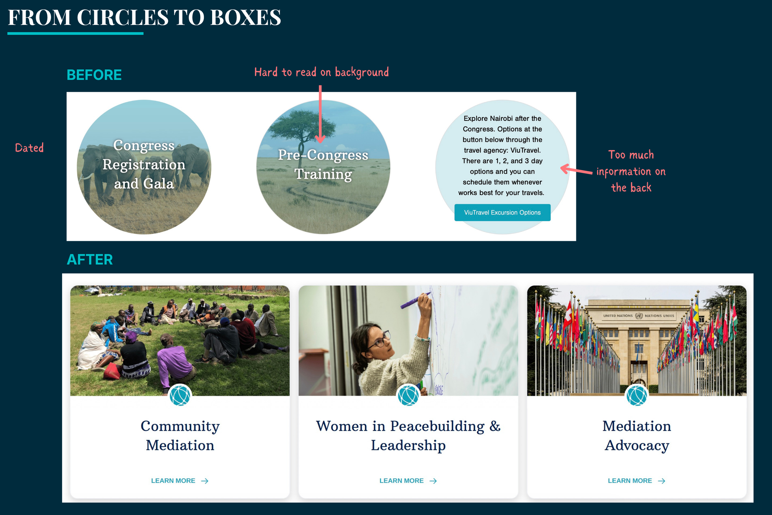
The website looked dated.
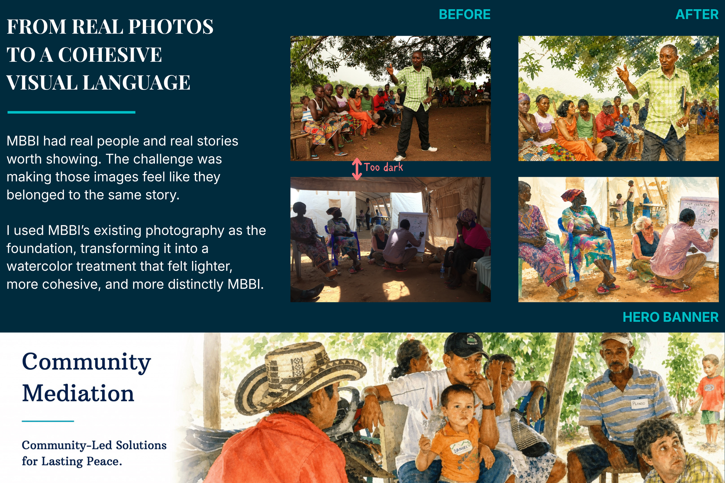
MBBI had plenty of real photography from its work, but much of it was older and often shot by amateurs. Stock photography could have created a more polished look, but it would have felt less authentic to MBBI.
I used AI to transform MBBI’s existing photography into a watercolor treatment. The watercolor helped brighten some of the darker, lower-quality photos while giving the images a more consistent look. This allowed me to keep the real people and places at the center while creating a more cohesive visual language. I also replaced dated elements, like the circular graphics, with a cleaner square format that felt more modern.
The result was a visual language that felt more cohesive, more current, and more distinctly MBBI.
BUILD A GUIDED EXPERIENCE
The website wasn’t built for people new to MBBI or peacebuilding.
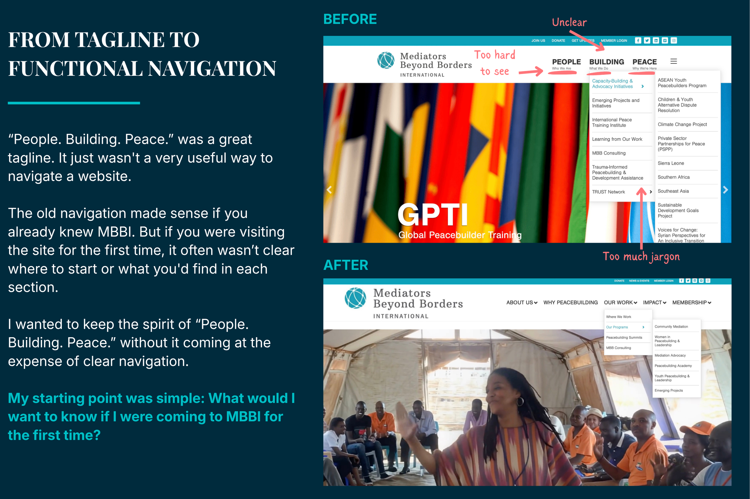
The old site had a lot to offer, but it often assumed visitors already understood MBBI and the peacebuilding field. The navigation, language, and page structure made people work to figure out where to start and how the pieces fit together.
I redesigned the experience around the questions a new visitor is likely to have. I simplified the path through the site, explained or removed jargon where possible, and organized the content around story and value—helping visitors understand who MBBI is, why peacebuilding matters, what MBBI does, and why the work is worth supporting.
My north star throughout the redesign was simple: Would this make sense if I were not a peacebuilder?
BRING THE STORY TO LIFE
MBBI had done incredible work, but the website didn't capture the story.
Decades of experience, programs, relationships, and impact were documented across the website, reports, and other materials, but much of that story was hidden in disparate places across the website and in the experiences of the people closest to the work. For a new visitor, the story was often invisible.
I looked for opportunities to show the work instead of simply describing it, using photography, video, stories, illustrations, and data to bring the experiences and perspectives of participants into the story, make the work more tangible, and help people understand not just what MBBI does, but why it matters.
The goal was to turn information into something people could see, understand, and remember.

The Work